Canvas
Adapting Canvas's existing features to reflect real student workflows: with more intuitive deadline tracking organized by course, easy to-do check-lists, and options to clear irrelevant notifications.
3 designers
User research, Ux Design
3 weeks
Figma
THE challenge
Canvas's planning gap.
Canvas is a widely used educational platform designed to facilitate course management and enhance communication between students and instructors.
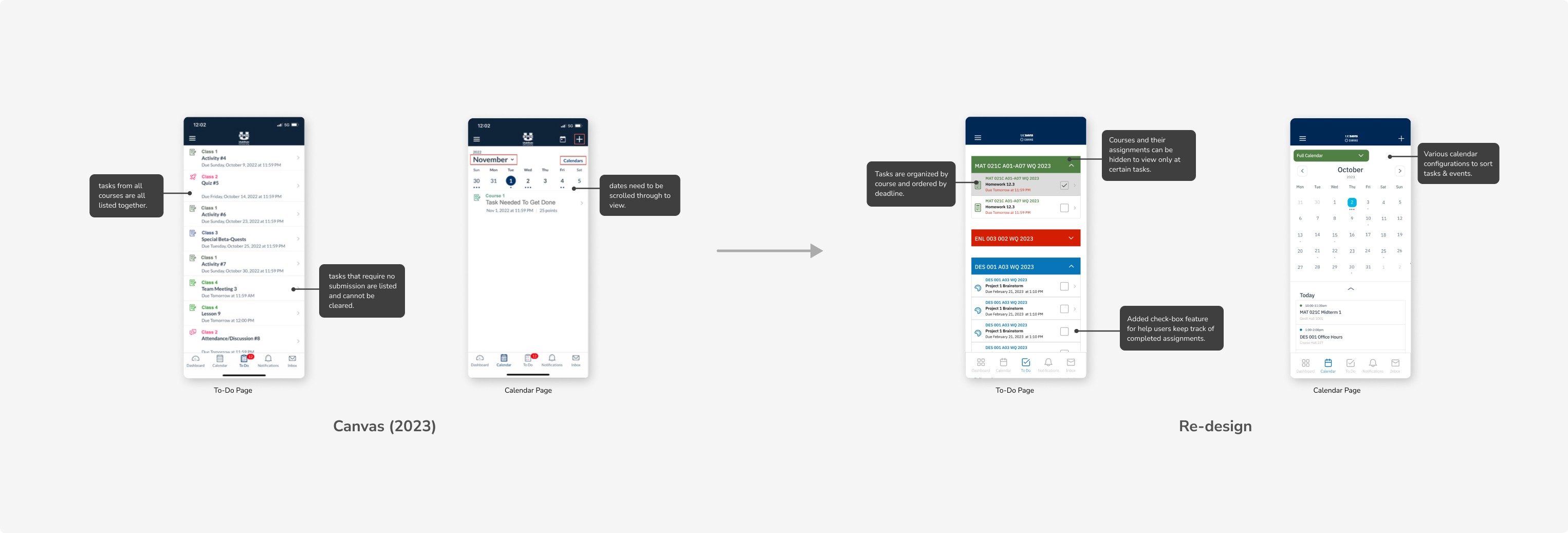
While Canvas excels at structuring course content (centralizing course documents, events, and assignments), it falls short in helping students manage deadlines and priorities — creating blocks in students' daily workflows.
After speaking with fellow undergraduates and taking into account my team's personal experiences with the platform, we discovered To-Do and Calendar pages seemed to be the root of the issue.
01.
Overcrowded
These pages were jammed with every assignment, exam reminders, and other miscellaneous deadline from all the student's enrolled courses.
02.
Static interface
Students couldn't dismiss irrelevant notifications, burying critical deadlines and increasing the risk of missed deadlines.
THE challenge
Canvas's planning gap.
Canvas is a widely used educational platform designed to facilitate course management and enhance communication between students and instructors.
While Canvas excels at structuring course content (centralizing course documents, events, and assignments), it falls short in helping students manage deadlines and priorities — creating blocks in students' daily workflows.
After speaking with fellow undergraduates and taking into account my team's personal experiences with the platform, we discovered the To-Do and Calendar pages seemed to be the root of the issue.
01.
Overcrowded
These pages were jammed with every assignment, exam reminders, and other miscellaneous deadline from all the student's enrolled courses.
02.
Static interface
Students couldn't dismiss irrelevant notifications, burying critical deadlines and increasing the risk of missed deadlines.
The solution
De-cluttering Canvas with course-based task organization.
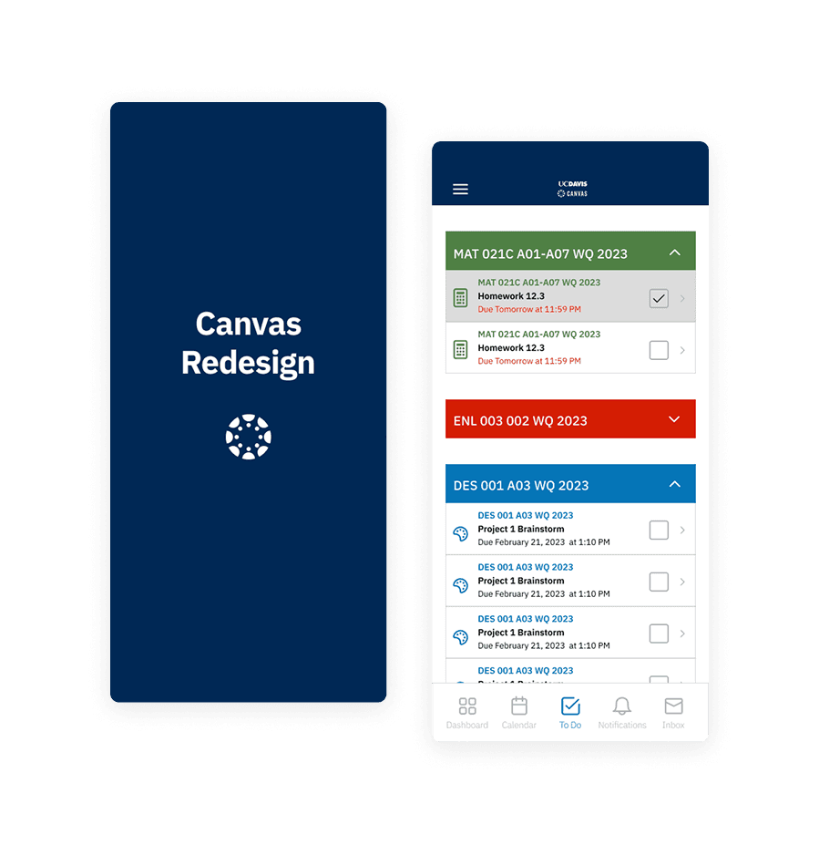
Our team proposed a solution to restructure Canvas’s task organizational system, sorting assignments & events by courses in drop-down tabs that can be opened and closed, making it more readable and reducing students' cognitive load as they can more easily navigate through upcoming deadlines.
Final prototype
Canvas — redesigned.
Streamlining task organization to boost student engagement.

Final prototype
Canvas — redesigned.
Streamlining task organization to boost student engagement.
Takeaways
Designing without reinventing.
My team and I's redesign intentionally preserved Canvas's existing style guide to maintain brand consistency while targeting specific feature improvements. This constraint-driven approach forced us to innovate within Canvas's design language so our changes felt intuitive rather than disruptive. For me, I learned how adjusting UX didn't mean sacrificing visual cohesion.